vue 文本编辑器插件 -- mavon-editor
AI 摘要鱼粮不足,AI 今天先歇着 · 正文在下面
一、下载安装
sh
npm install mavon-editor二、全局注册
js
import mavonEditor from "mavon-editor";
import "mavon-editor/dist/css/index.css";
Vue.use(mavonEditor);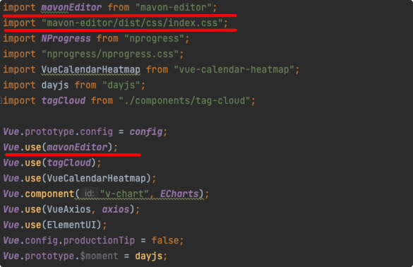
三、使用
在需要使用的页面导入
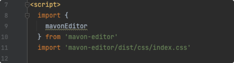
注册组件

接着在 template 中使用它

具体代码如下:
html
<template>
<mavon-editor class="me-editor" ref="md" v-model="editor.value" @imgAdd="imgAdd" v-bind="editor">
</mavon-editor>
</template>
<script>
import {mavonEditor} from 'mavon-editor'
import 'mavon-editor/dist/css/index.css'
import {upload} from '@/api/upload'
export default {
name: 'MarkdownEditor',
props: {
editor: Object
},
components: {mavonEditor},
data() {
return {}
},
mounted() {
this.$set(this.editor, 'ref', this.$refs.md)
},
methods: {
// 添加图片
imgAdd(pos, $file) {
let that = this
// 构造表单提交结构
let formdata = new FormData();
formdata.append('image', $file);
upload(formdata).then(data => {
// 第二步.将返回的url替换到文本原位置 -> 
if (data.success) {
// 将当前下标位置的图片替换为真正的链接图片
that.$refs.md.$img2Url(pos, data.data);
} else {
that.$message({
message: data.msg,
type: 'error',
showClose: true
})
}
}).catch(err => {
that.$message({
message: err,
type: 'error',
showClose: true
});
})
}
},
}
</script>
<style scoped>
.me-editor {
z-index: 6 !important;
}
.v-note-wrapper.fullscreen {
top: 60px !important
}
</style>四、使用效果
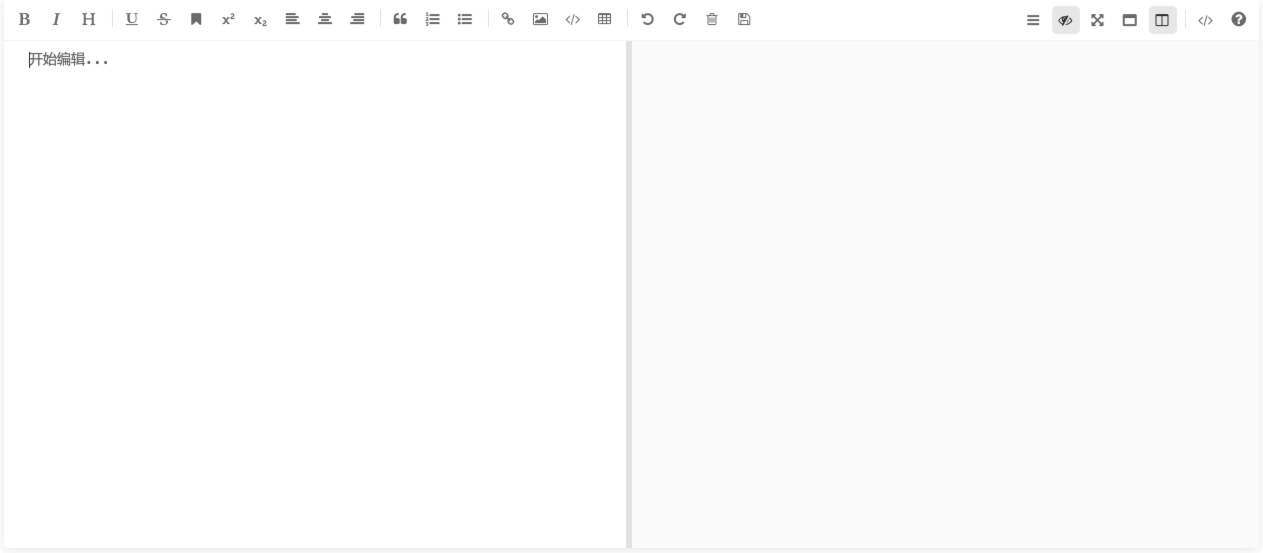
五、API
具体可查看官方文档 https://www.npmjs.com/package/mavon-editor
props
| name 名称 | type 类型 | default 默认值 | describe 描述 |
|---|---|---|---|
| value | String | 初始值 | |
| language | String | zh-CN | 语言选择,暂支持 zh-CN: 简体中文, zh-TW: 正体中文 , en: 英文 , fr: 法语, pt-BR: 葡萄牙语, ru: 俄语, de: 德语, ja: 日语 |
| fontSize | String | 14px | 编辑区域文字大小 |
| scrollStyle | Boolean | true | 开启滚动条样式(暂时仅支持chrome) |
| boxShadow | Boolean | true | 开启边框阴影 |
| boxShadowStyle | String | 0 2px 12px 0 rgba(0, 0, 0, 0.1) | 边框阴影样式 |
| transition | Boolean | true | 是否开启过渡动画 |
| toolbarsBackground | String | #ffffff | 工具栏背景颜色 |
| previewBackground | String | #fbfbfb | 预览框背景颜色 |
| subfield | Boolean | true | true: 双栏(编辑预览同屏), false: 单栏(编辑预览分屏) |
| defaultOpen | String | edit: 默认展示编辑区域 , preview: 默认展示预览区域 , 其他 = edit | |
| placeholder | String | 开始编辑... | 输入框为空时默认提示文本 |
| editable | Boolean | true | 是否允许编辑 |
| codeStyle | String | code-github | markdown样式: 默认github, 可选配色方案 |
| shortCut | Boolean | true | 是否启用快捷键 |
| toolbarsFlag | Boolean | true | 工具栏是否显示 |
| navigation | Boolean | false、 默认展示目录 | |
| imageFilter | function | null | 图片过滤函数,参数为一个File Object,要求返回一个Boolean, true表示文件合法,false表示文件不合法 |
| imageClick | function | null | 图片点击事件,默认为预览,可覆盖 |
| tabSize | Number | \t | tab转化为几个空格,默认为\t |
| xssOptions | Object | null | xss规则配置,参考 github.com/leizongmin/… |
| toolbars | Object | 如下例 | 工具栏 |
js
/*
    默认工具栏按钮全部开启, 传入自定义对象
    例如: {
         bold: true, // 粗体
         italic: true,// 斜体
         header: true,// 标题
    }
    此时, 仅仅显示此三个功能键
 */
toolbars: {
  bold: true, // 粗体
  italic: true, // 斜体
  header: true, // 标题
  underline: true, // 下划线
  strikethrough: true, // 中划线
  mark: true, // 标记
  superscript: true, // 上角标
  subscript: true, // 下角标
  quote: true, // 引用
  ol: true, // 有序列表
  ul: true, // 无序列表
  link: true, // 链接
  imagelink: true, // 图片链接
  code: true, // code
  table: true, // 表格
  fullscreen: true, // 全屏编辑
  readmodel: true, // 沉浸式阅读
  htmlcode: true, // 展示html源码
  help: true, // 帮助
  /* 1.3.5 */
  undo: true, // 上一步
  redo: true, // 下一步
  trash: true, // 清空
  save: true, // 保存(触发events中的save事件)
  /* 1.4.2 */
  navigation: true, // 导航目录
  /* 2.1.8 */
  alignleft: true, // 左对齐
  aligncenter: true, // 居中
  alignright: true, // 右对齐
  /* 2.2.1 */
  subfield: true, // 单双栏模式
  preview: true, // 预览
}events 事件绑定
| name 方法名 | params 参数 | describe 描述 |
|---|---|---|
| change | String: value , String: render | 编辑区发生变化的回调事件(render: value 经过markdown解析后的结果) |
| save | String: value , String: render | ctrl + s 的回调事件(保存按键,同样触发该回调) |
| fullScreen | Boolean: status , String: value | 切换全屏编辑的回调事件(boolean: 全屏开启状态) |
| readModel | Boolean: status , String: value | 切换沉浸式阅读的回调事件(boolean: 阅读开启状态) |
| htmlCode | Boolean: status , String: value | 查看html源码的回调事件(boolean: 源码开启状态) |
| subfieldToggle | Boolean: status , String: value | 切换单双栏编辑的回调事件(boolean: 双栏开启状态) |
| previewToggle | Boolean: status , String: value | 切换预览编辑的回调事件(boolean: 预览开启状态) |
| helpToggle | Boolean: status , String: value | 查看帮助的回调事件(boolean: 帮助开启状态) |
| navigationToggle | Boolean: status , String: value | 切换导航目录的回调事件(boolean: 导航开启状态) |
| imgAdd | String: filename, File: imgfile | 图片文件添加回调事件(filename: 写在md中的文件名, File: File Object) |
| imgDel | String: filename | 图片文件删除回调事件(filename: 写在md中的文件名) |
六、自定义工具栏
下边是官方自定义示例,可以看到使用的是 vue 的插槽功能
html
<mavon-editor>
  <!-- 左工具栏前加入自定义按钮 -->
  <template slot="left-toolbar-before">
    <button
      type="button"
      @click="$click('test')"
      class="op-icon fa fa-mavon-align-left"
      aria-hidden="true"
      title="自定义"
    ></button>
  </template>
  <!-- 左工具栏后加入自定义按钮  -->
  <template slot="left-toolbar-after">
    <button
      type="button"
      @click="$click('test')"
      class="op-icon fa fa-mavon-align-left"
      aria-hidden="true"
      title="自定义"
    ></button>
  </template>
  <!-- 右工具栏前加入自定义按钮  -->
  <template slot="right-toolbar-before">
    <button
      type="button"
      @click="$click('test')"
      class="op-icon fa fa-mavon-align-left"
      aria-hidden="true"
      title="自定义"
    ></button>
  </template>
  <!-- 右工具栏后加入自定义按钮  -->
  <template slot="right-toolbar-after">
    <button
      type="button"
      @click="$click('test')"
      class="op-icon fa fa-mavon-align-left"
      aria-hidden="true"
      title="自定义"
    ></button>
  </template>
</mavon-editor>1、字体颜色工具
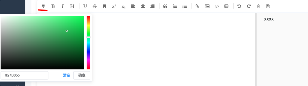
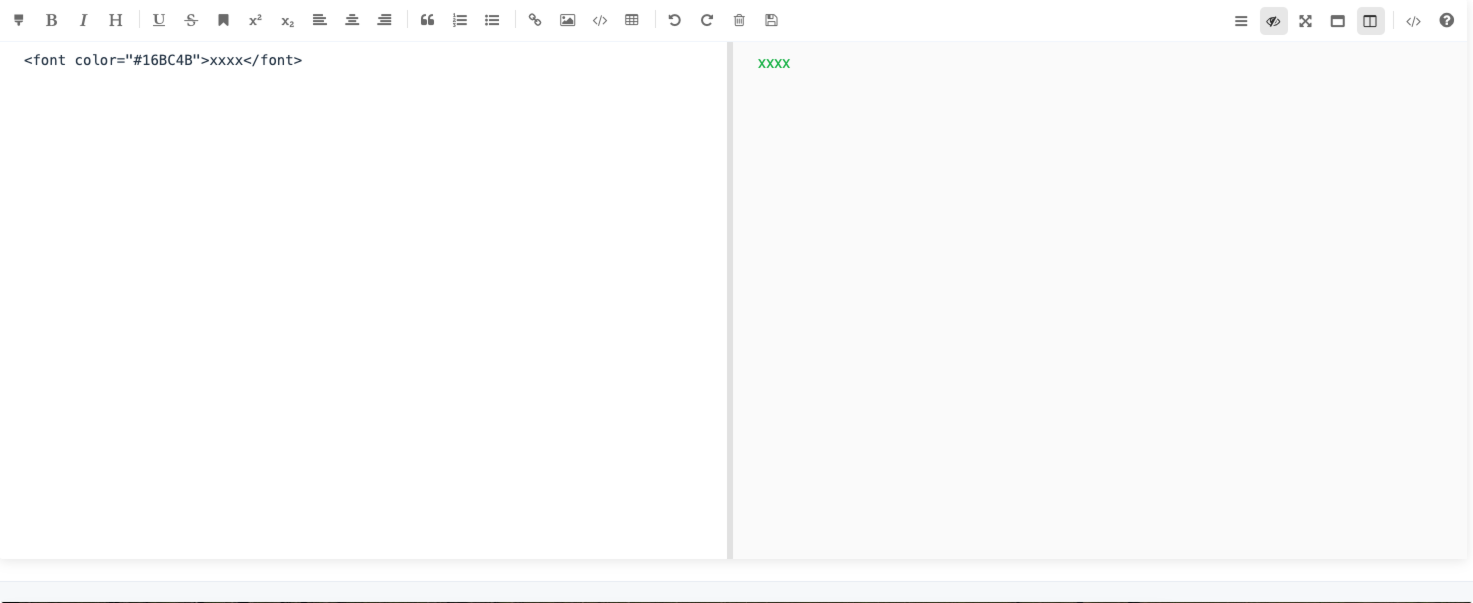
下边我添加个字体颜色的工具栏,我当前项目中已经引入了element-ui的组件,其中包括了它自带的el-color-picker组件
下边是修改后的部分代码
html
<mavon-editor class="me-editor" ref="md" v-model="editor.value" @imgAdd="imgAdd" v-bind="editor">
  <!-- 插槽 -->
  <button
      slot="left-toolbar-before"
      type="button"
      aria-hidden="true"
      title="颜色"
      class="op-icon"
      style="position: relative"
  >
    <i class="el-icon-s-open"/>
    <el-color-picker
        v-model="color_val"
        class="my-pick-color"
        @change="activeChange"
    />
  </button>
</mavon-editor>修改颜色的方法
js
// 修改颜色
activeChange(e) {
  const insert_text = {
    prefix: `<font color="${e}">`,
    subfix: '</font>',
    str: ''
  };
  // 使用span标签,里面的style会被过滤掉,导致颜色不生效。所以使用上面的font标签
  // const insert_text = {
  //   prefix: `<span style="color: ${e}">`,
  //   subfix: '</span>',
  //   str: ''
  // };
  const $vm = this.$refs.md;
  $vm.insertText($vm.getTextareaDom(), insert_text);
},按钮样式
css
.my-pick-color {
  opacity: 0;
  position: absolute;
  top: 0;
  left: 0
}
我这里选中字体,选择需要修改的颜色,还是很简单的。
2、自定义高亮颜色
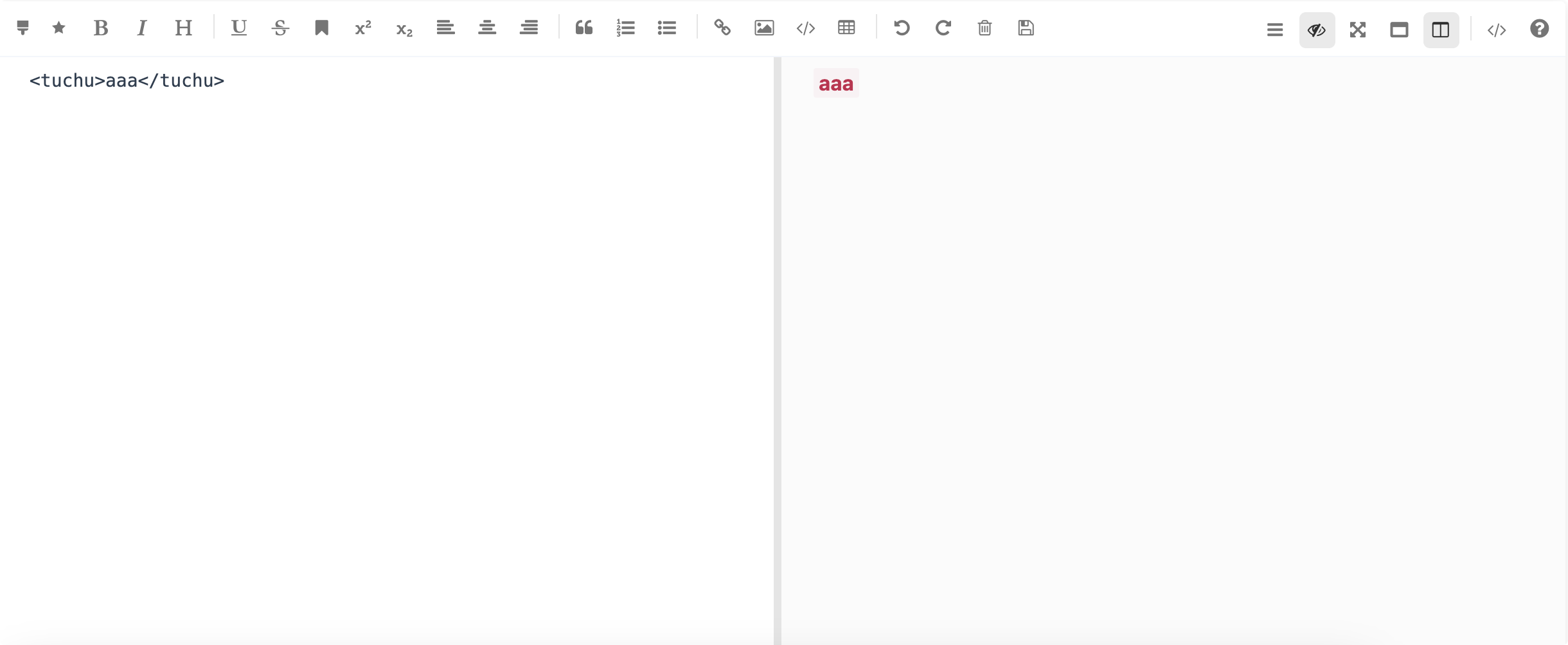
首先我们定义下一个自定义高亮标签
css
tuchu{
    font-weight: 700;
    color: #c7254e !important;
    background-color: #f9f2f4 !important;
    border-radius: 2px;
    padding: 2px 4px;
}
接着使用插槽
html
<mavon-editor>
<button
    slot="left-toolbar-before"
    type="button"
    aria-hidden="true"
    title="自定义高亮(红色)"
    class="op-icon"
    style="position: relative"
    @click="customMask"
>
  <i class="el-icon-star-on"/>
</button>
</mavon-editor>
按钮方法
js
// 自定义高亮
customMask() {
  const insert_text = {
    prefix: `<tuchu>`,
    subfix: `</tuchu>`,
    str: ''
  };
  const $vm = this.$refs.md;
  $vm.insertText($vm.getTextareaDom(), insert_text);
}
效果
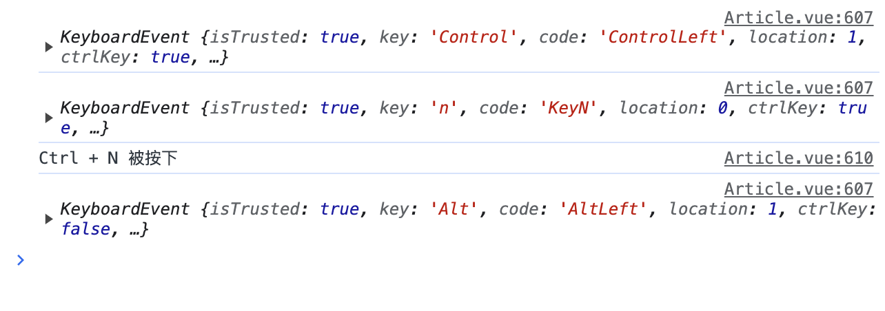
如果需要加上快捷键监听,可以在当前页面注册监听键盘按键事件
js
// 注册监听键盘按键事件
mounted() {
  window.addEventListener('keydown', this.customMaskHandleKeyDown);
},
// 销毁监听事件
beforeUnmount() {
  window.removeEventListener('keydown', this.customMaskHandleKeyDown);
},
然后定义处理方法
js
// 监听是否按了某快捷键
customMaskHandleKeyDown(event) {
  console.log(event)
  // 检查是否按下了 Ctrl + N
  if (event.ctrlKey && event.key === 'n') {
    console.log('Ctrl + N 被按下');
    this.customMask();
  }
}
评论
0 条—
还没有评论,来说第一句